A company’s logo is perhaps the most important aspect of its branding. It is the face of the company, its product, or its services, and connects the brand with its consumers. A lot of time and thought is invested behind the scenes to create a suitable, memorable logo.
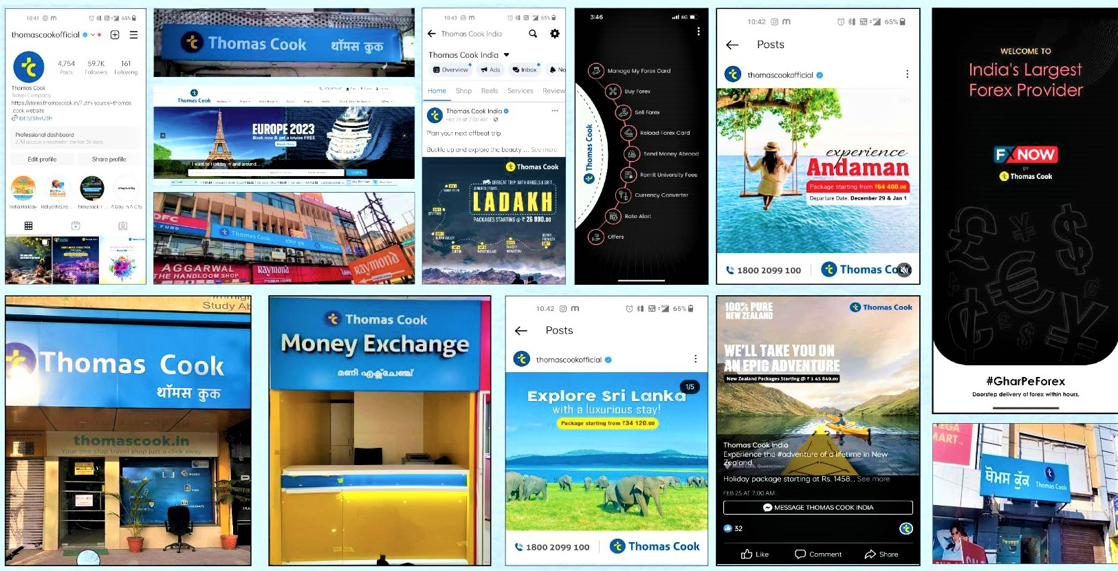
The pandemic has changed several norms in the travel industry, and to keep pace with the changing environment, and the new expectations of our customers, we refreshed the familiar Thomas Cook logo with a stronger, more impactful, digital-friendly identity.
Our dynamic new logo with a lowercase t & c – represents a younger, more friendly, digital-first, already popular abbreviation of our brand name.
It embodies our fluid and dynamic personality, as we transform continually in line with the rapidly changing travel services industry, and reconfirms our continued commitment to customer delight with unmatched travel experiences.
The new logo has evolved to complement the latest trends in current times, and will work as an indicator for consumers to look forward to the new changes the company is planning for its customers.

